
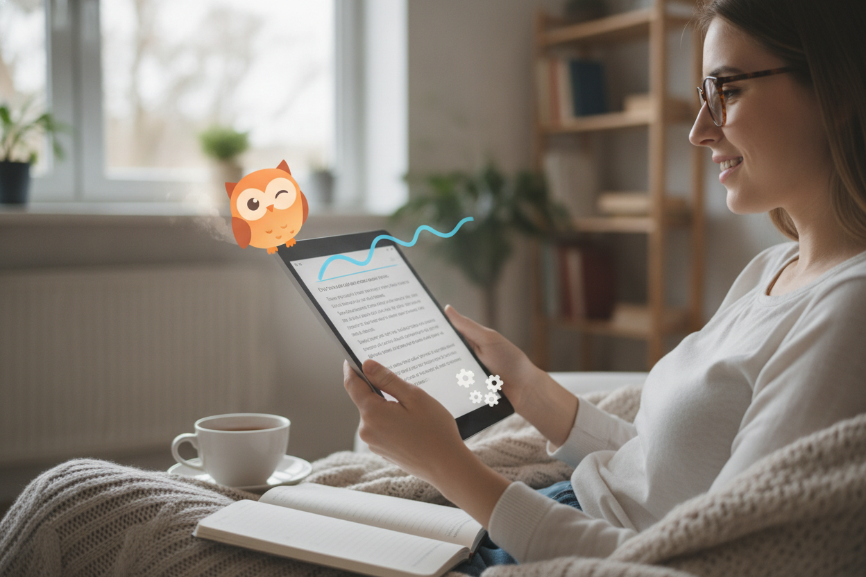
Animation works best on a blog when it helps readers move through the page. The goal is not to impress with constant movement, but to create a smoother and more engaging reading experience. Small transitions can cue the eye, mark a section change, or bring attention to a featured quote or image.
One of the smartest uses of animation is pacing. When a page loads in layers, readers can absorb the content in sequence instead of facing everything at once. That can make a long article feel lighter and easier to follow. Motion can also reinforce hierarchy by showing which elements are primary and which are supporting details.
For creative content, animation adds personality. A gentle fade, a slide, or a looping accent can make the site feel expressive without becoming chaotic. The trick is to keep the effects consistent across the platform so the visual language feels deliberate. Repetition helps readers learn the site’s rhythm and builds trust in the experience.
Accessibility should always come first. Provide smooth fallbacks for users who prefer reduced motion, and avoid effects that interfere with legibility. When animation serves the reading flow, it enhances the post rather than competing with it. That balance is what turns motion into a useful part of the content strategy instead of a flashy afterthought.
Leave a Reply