
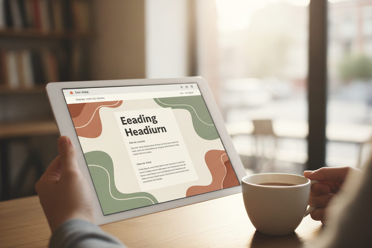
Readability is one of the most important parts of a creative blog, even when the site is intentionally artistic. Beautiful visuals may attract attention, but readers stay when the content is easy to follow. Clear typography, consistent spacing, and a logical structure make the experience more enjoyable and more trustworthy.
Readable design begins with comfort. Long lines of text, weak contrast, or overly decorative fonts can quickly tire the eye. A creative audience may appreciate experimentation, but they still need a page that respects their attention. That means building a layout where the writing can breathe and where important information is easy to find.
Readability also supports storytelling. When the page is clear, the reader can focus on the ideas instead of fighting the interface. That makes opinions, tutorials, and reflective pieces feel stronger because the message lands cleanly. Good readability gives creative content more room to do its work.
There is a common misconception that minimalist text design is less expressive. In reality, strong readability can make a site feel more confident. It shows that the platform understands its audience and values the reading experience as much as the visuals. For a blog built around creative distribution, that balance is essential. If the content is worth sharing, it should also be worth reading comfortably from beginning to end.
Leave a Reply