
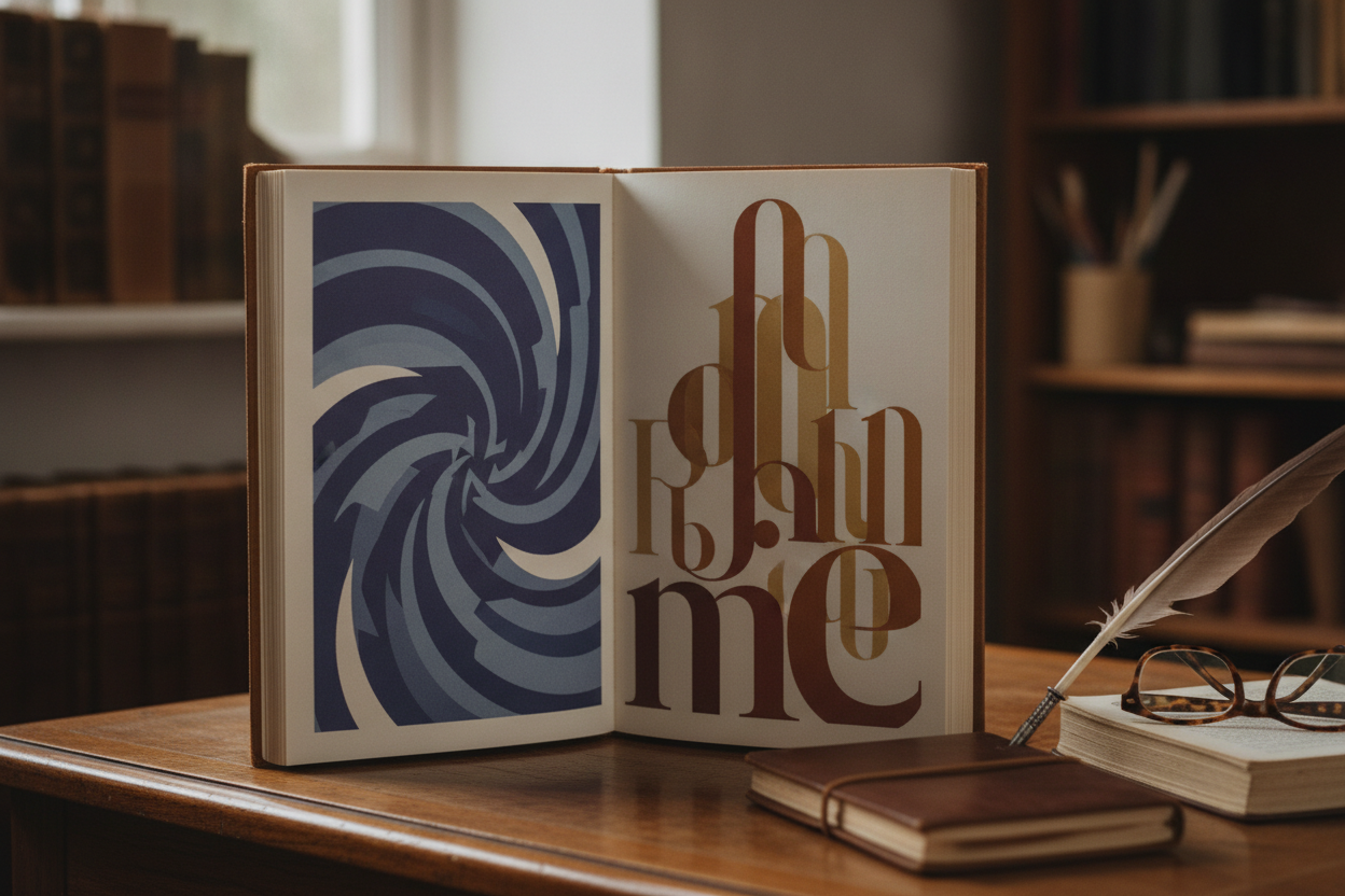
Typography plays a central role in any story-driven layout. It shapes the mood of the page before the reader absorbs a single sentence. On a creative blog, the right type choices can make a post feel elegant, bold, playful, or experimental while still remaining readable and approachable.
The first priority is clarity. If the typeface looks interesting but makes reading difficult, it is not helping the content. Pair display fonts carefully with highly legible body text, and make sure spacing, line height, and contrast support long reading sessions. Creative audiences appreciate style, but they still value comfort.
Typography can also guide attention. Larger headlines establish hierarchy, while smaller supporting text helps organize details like captions, notes, and metadata. If the page includes visual artwork, the font choices should complement the imagery instead of competing with it. This creates a more unified experience across the article.
For blogs that mix text and graphics, typography becomes part of the storytelling itself. A sharp sans-serif can make a modern editorial post feel clean and current, while a serif can add warmth and depth. The best choice depends on the voice of the site and the emotional tone of the article. When typography is used thoughtfully, it quietly strengthens the entire reading experience.
Leave a Reply