
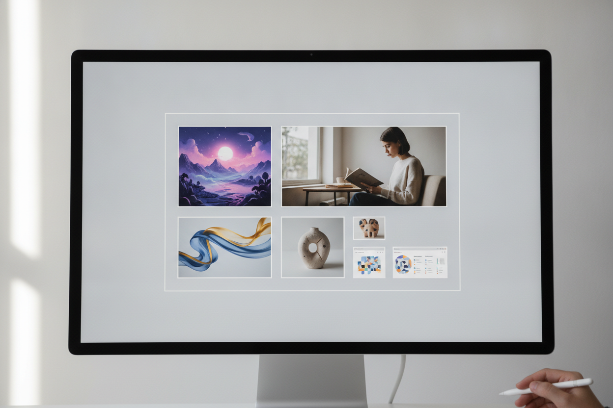
A clear content grid can make a creative blog feel organized without making it boring. For a site that publishes mixed media, the grid acts as the framework that keeps images, text, and animation aligned. It gives the page structure, which is especially important when every post may feature a different format or visual style.
The most effective grids are flexible. Some stories deserve a wide feature area, while others work better in smaller modules. By mixing column widths and card sizes, you can create visual variety while still preserving consistency. Readers should be able to scan the page quickly, recognize what is new, and understand where to click next.
Typography should work with the grid, not against it. If text is too dense or too narrow, the layout feels crowded. If it is too loose, the page loses momentum. Aim for generous spacing, clear contrast, and enough room for featured images to breathe. That approach makes long-form content easier to read and visually reduces fatigue.
A strong grid also supports storytelling. You can use it to show progression, group related themes, or break up complex content into digestible sections. On a platform built around creative distribution, that kind of structure helps the site feel both artistic and reliable. It is a way to let the work shine while quietly guiding the reader through the experience.
Leave a Reply